When it comes to living rooms, color isn’t just a background, it’s the first act of your home’s play. Picture this: you walk into a room drenched in warm, inviting hues that instantly make you feel at ease. Or perhaps a bold, dynamic palette screams, “Welcome to my vibrant world.” Understanding color schemes for living rooms can be the magic touch you need to create a harmonious and stunning space. Let’s jump into the colorful world of living room design together.
Understanding Color Theory
The Psychology of Colors
Color isn’t just visual: it plays with our emotions. Ever notice how blue can feel calming while red revs up excitement? Research suggests that different shades impact our mood and behavior, setting the stage for your living room’s vibe. A soft, golden yellow can energize the space, fostering cheerfulness, while muted greens can evoke serenity and connection to nature. Understanding the psychology of colors is crucial for a livable and inviting atmosphere.
Color Wheel Basics
Knowing the color wheel is like having a secret weapon for your design arsenal. It’s not just about picking colors at random: it’s about understanding their relationships. Primary colors, red, blue, and yellow, form the basis, while secondary and tertiary colors come from mixing them together. Complementary colors, located opposite each other on the wheel, create vibrant contrasts, while analogous colors, sitting next to each other, promote harmony. Mastering this wheel can transform an ordinary living room into a well-composed masterpiece.
Choosing a Color Palette
Monochromatic Color Schemes
For those who love simplicity, a monochromatic color scheme might hit the spot. This approach utilizes varying shades and tints of a single color, creating depth without overwhelming the senses. Imagine a serene living room washed in different shades of calm blue, each piece seamlessly ties together while offering enough variance to keep things interesting.
Analogous Color Schemes
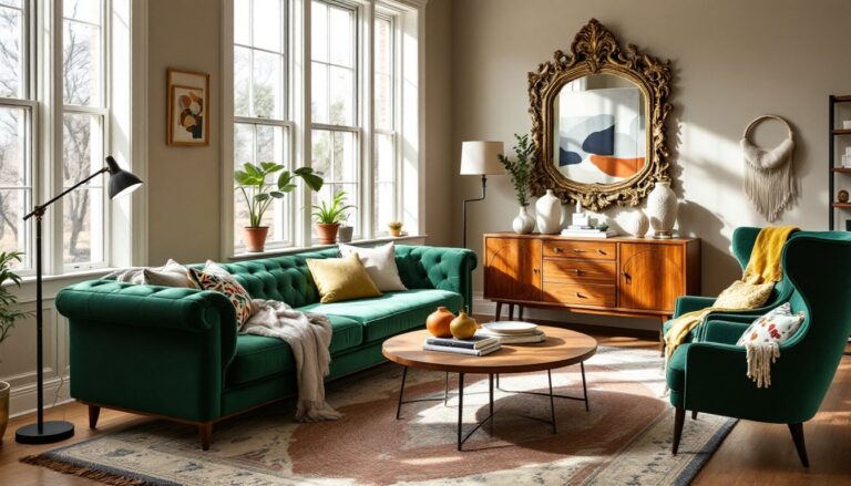
Not far from monochromatic schemes, analogous color schemes use colors that live next to each other on the color wheel. Picture a living room composed of soft greens, blues, and teals. This palette naturally flows and brings a sense of unity. It’s perfect for those wanting a cohesive look that feels fresh without feeling flat, truly a style that whispers rather than shouts.
Complementary Color Schemes
Contrary to the previous palettes, complementary color schemes dance between bold contrasts. Imagine setting deep purple against a lively yellow. This striking combination energizes the space, making it pop with personality. Such a palette demands attention and injects character into the living room, defining areas through playful contrasts.
Popular Color Combinations
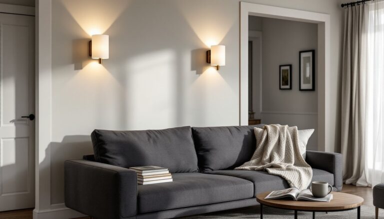
Neutral and Earthy Tones
Nothing says timeless like a palette of neutral and earthy tones. Think warm browns, soft grays, and creamy whites. This color scheme radiates sophistication and comfort, making it an ideal backdrop for any decor style, from rustic to modern. Plus, it serves as a canvas for colorful accents, letting your personality shine through easily.
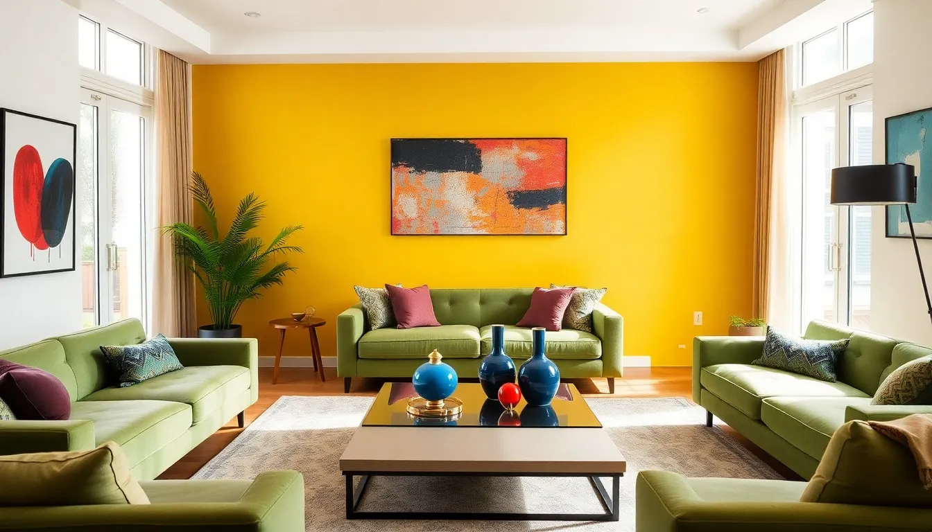
Bold and Vibrant Colors
On the opposite spectrum lies the world of bold and vibrant colors. Imagine a burst of fuchsia, electric blue, or burnt orange. This palette is about making a statement and filling the living room with charisma. It’s excellent for spontaneous hosts who want their space to mirror their lively personalities. But, moderation is crucial, as too much can overwhelm.
Pastel and Soft Shades
Soft, pastel palettes create a soothing atmosphere, reminiscent of a lazy Sunday afternoon. Think pale pinks, soft lilacs, or icy blues. Such shades are perfect for creating a gentle ambiance in a living room, ideal for relaxing or socializing quietly. They serve as a reminder that beauty can be subtle, yet powerful.
Tips for Implementing Color Schemes
Using Accessories and Decor
Accessories are the cherry on top when implementing color schemes. Think about using throw pillows, area rugs, and artwork to incorporate your chosen colors. They’re like little bursts of joy that tie a room together without necessitating a full re-paint. Ensuring your accessories harmonize with your color palette can elevate the living room aesthetic significantly.
Painting Techniques and Finishes
Don’t underestimate the power of painting techniques and finishes. A matte wall can feel cozy, while a glossy finish adds a modern edge. Techniques like color blocking and ombre effects can introduce depth and creativity. When painting, consider how different textures play with light, this impacts how colors appear in various lighting conditions, making your living room feel youthful and fresh.
Lighting Considerations
Natural vs. Artificial Light
Lighting plays a pivotal role in how colors are perceived. Natural light brings out the vibrancy and warmth of colors making them come alive, while artificial light can create shadows and alter hues. When designing a color scheme, take note of the amount of natural light the living room receives. A sunny room may benefit from bolder colors, whereas a dim space might need softer, warmer hues to feel welcoming.
Seasonal Color Adjustments
Ever thought about rotating your living room color scheme with the seasons? As nature changes, so can your decor. In the fall, embracing warm oranges and reds can bring coziness, while soft blues and greens in spring can evoke freshness. Seasonal adjustments not only keep the living room lively but also engage with the rhythms of nature, keeping the design feeling fresh and relevant.