Beige has shaken off its boring reputation. Today’s warm beiges aren’t the builder-grade flat tans of the 90s, they’re complex, layered neutrals that bring warmth without committing to bold color. They anchor a room, play well with both modern and traditional furniture, and adapt to natural light shifts throughout the day. Whether a living room gets blasted with southern sun or sits on the shadowy north side, the right warm beige can make it feel inviting without the stark coldness of gray or the yellowing of cream gone wrong. This guide covers the warm beige shades designers keep specifying in 2026, how to choose one that works with existing furniture, and the prep steps to ensure the color lands right on the wall.
Table of Contents
ToggleKey Takeaways
- Warm beige paint colors offer a modern, versatile alternative to bold hues and cold grays, working seamlessly across coastal, mid-century, and farmhouse design styles without the risk of looking dated.
- Test warm beige samples on multiple walls and times of day to account for light direction—a shade perfect at 10 a.m. may shift significantly by afternoon depending on sun exposure.
- Designer-recommended warm beige paints like Benjamin Moore Pale Oak and Sherwin-Williams Accessible Beige perform well under mixed lighting (incandescent, LED, and natural) without shifting to unwanted green or purple tones.
- Pair warm beige walls with darker furniture, layered warm tones, and strategic white accents to create visual interest and prevent the room from feeling flat or washed out.
- Choose sheen based on lifestyle—eggshell suits most living rooms, satin works in high-traffic homes with pets or children, and matte is best for formal spaces where durability is less critical.
- Account for flooring, existing trim color, and adjacent room colors when selecting warm beige to ensure a cohesive palette that doesn’t clash at transitions in open-concept layouts.
Why Warm Beige Is Perfect for Modern Living Rooms
Warm beige bridges the gap between the stark white trend of the 2010s and the greige surge that followed. It adds softness without reading as dated. Designers favor it because it reflects more light than mid-tone grays, making smaller living rooms feel airier, and it doesn’t cast the cold blue-gray tint that some greiges do under LED bulbs.
From a practical standpoint, warm beige hides minor wall imperfections better than pure white, scuffs, patched nail holes, and slight texture variations blend in more easily. It also serves as a flexible backdrop for art, textiles, and accent walls. A living room painted in a warm beige can shift from coastal to mid-century to farmhouse depending on what furniture and decor get paired with it.
In terms of lighting, warm beige responds better to mixed light sources. Incandescent, LED, and natural daylight all shift paint color, but warm beiges with yellow or peachy undertones stay consistent instead of turning green or purple under certain bulbs. That consistency matters when a living room pulls double duty as a workspace or evening entertainment zone.
Finally, resale appeal matters for many homeowners. Neutral, warm tones test well with buyers. A living room that feels move-in ready without needing immediate repainting is a quiet selling point. Warm beige delivers that without the risk of polarizing tastes the way a bold accent wall might.
Top Warm Beige Paint Colors That Designers Love
Creamy Beiges With Yellow Undertones
These are the go-to shades for living rooms that need warmth but can’t risk looking too pink or gray. They read as soft cream in bright light and deepen to a warm tan in lower light. Several designers consistently recommend similar tones across brands, and understanding why helps narrow choices.
Benjamin Moore Manchester Tan (HC-81) sits at the warm end of the spectrum without crossing into mustard territory. It has enough yellow to counteract cool northern light but doesn’t look dingy in south-facing rooms. Coverage is typically 350–400 square feet per gallon at standard wall texture.
Sherwin-Williams Accessible Beige (SW 7036) is one of the most specified beiges in new construction and remodels. It leans slightly greige but the yellow undertone keeps it from going cold. It works especially well in open-concept spaces where the living room flows into a kitchen with stainless appliances, those cool metals benefit from a warm wall tone.
Farrow & Ball Setting Plaster (No. 231) is a UK favorite gaining traction in the US market. It’s a soft, creamy beige with a chalky finish in their Estate Emulsion line. The pigment density is higher than typical US paints, so expect 650 square feet per gallon with their formulation, though two coats are still standard for full opacity.
Behr Wheat Bread (N270-3) offers a budget-friendly option with similar warmth to Manchester Tan. The yellow undertone is pronounced, so test it in the room before committing to five gallons. Behr’s Marquee line offers one-coat coverage claims, but on textured drywall or over darker colors, plan for two coats.
Beiges With Pink and Peachy Undertones
These shades bring a subtle blush to walls, which sounds risky but works beautifully in living rooms with a lot of wood trim, leather furniture, or warm-toned hardwood floors. The pink undertone softens harsh shadows and complements skin tones in family photos on the walls.
Benjamin Moore Pale Oak (OC-20) is a chameleon. In cool light, it reads as a soft greige: in warm light, the peachy-pink undertone emerges. It’s a favorite for living rooms with white oak flooring or natural fiber rugs because it echoes those warm, organic tones. Most homeowners find that popular paint colors in this undertone range pair well with both brass and matte black hardware.
Sherwin-Williams Kilim Beige (SW 6106) has a stronger pink undertone than most warm beiges, but it never reads as bubblegum. It’s warm, grounding, and works especially well in living rooms with a lot of textured fabrics, linen, wool, jute. The color holds up under warm Edison-style LED bulbs without turning orange.
Valspar Sandstone Sand (3005-3C) offers a peachy warmth that complements terracotta accents and natural wood. It’s in the mid-range price bracket and performs well in terms of hide and washability. Expect standard 400 square feet per gallon coverage.
Dunn-Edwards Swiss Coffee (DEC 719) technically straddles the line between off-white and warm beige, but its peachy undertone makes it read as beige in most lighting. It’s a safe choice for homeowners nervous about going too dark. It also serves as a strong base coat if testing multiple beige samples on the same wall.
For living rooms that serve as multi-functional spaces, homeowners often explore color schemes that allow warm beige to anchor the palette while accent colors shift seasonally.
How to Choose the Right Warm Beige for Your Living Room
Choosing a beige isn’t as simple as grabbing a sample card. Light direction, existing finishes, and adjacent rooms all influence how the color performs.
Test in actual light conditions. Paint large sample boards, at least 2 feet by 2 feet on poster board or primed drywall scraps. Move them around the room throughout the day. A beige that looks perfect at 10 a.m. might turn sallow by 4 p.m. if the room gets heavy afternoon sun. Test on multiple walls, especially the wall opposite windows and the one that gets the least light.
Consider existing trim color. If the living room has bright white trim (like Benjamin Moore Chantilly Lace or Sherwin-Williams Pure White), a warm beige with yellow undertones creates a clean contrast. If the trim is off-white or cream, a beige with peachy undertones ties the palette together without creating a jarring line where wall meets molding.
Factor in flooring. Warm beige works well over most wood tones, but if the floor is cool-toned (gray-washed oak, for example), choose a beige with just a hint of gray in it to avoid a clash. Over red oak or walnut, lean into the yellow or peachy undertones. Many interior designers featured on Home Bunch emphasize the importance of testing paint samples against flooring before making final decisions.
Account for adjacent rooms. In open-concept layouts, the living room beige needs to play nicely with kitchen backsplash, dining room wainscoting, or hallway colors. If those spaces are cooler or grayer, a warm beige can feel jarring at the transition. Consider a transitional greige or use trim color to create a clean break between zones.
Check the LRV (Light Reflectance Value). This number (0–100) tells how much light a color reflects. Most warm beiges fall between 50 and 70 LRV. Higher LRV means a lighter, airier feel: lower LRV adds coziness but can make small spaces feel tight. For living rooms under 200 square feet, stick to LRVs above 60.
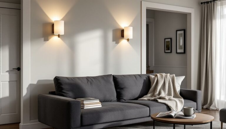
Sheen matters as much as color. Eggshell is the go-to for living room walls, durable enough to wipe down, but not reflective enough to highlight every drywall seam. Satin works in high-traffic homes with kids or pets: it’s scrubbable but can show roller marks if application isn’t even. Matte/flat is for low-traffic formal living rooms and hides imperfections best, but scuffs don’t wipe clean easily.
Pairing Warm Beige Walls With Furniture and Decor
Warm beige is forgiving, but it’s not foolproof. The wrong pairings can make a room feel washed out or overly matchy.
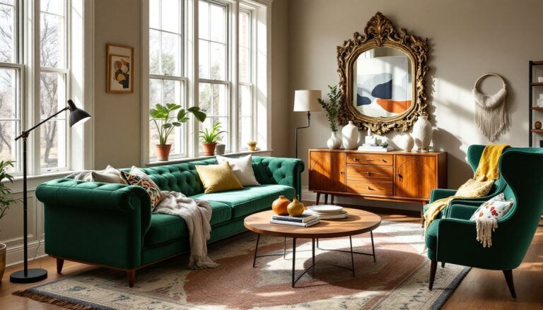
Contrast with darker furniture. Warm beige walls make charcoal gray sofas, espresso wood tables, and black metal accents pop without harsh contrast. The beige softens the drama of dark furniture and keeps the room from feeling too heavy. Add texture through throws, pillows, and rugs to avoid a flat look.
Layer warm tones. Pair warm beige walls with caramel leather, terracotta pottery, rust-colored textiles, and natural wood finishes. This monochromatic approach feels cohesive and calming. To avoid blandness, vary the depth, pair a light beige wall with a deeper tan sofa and burnt sienna pillows.
Introduce cool accents sparingly. Navy blue, deep teal, or charcoal accents create visual interest without overwhelming the warmth. Too much cool color against warm beige can make the room feel disjointed. Stick to the 60-30-10 rule: 60% beige/neutral, 30% warm secondary color, 10% cool accent.
Use white strategically. Crisp white trim, white linen curtains, or a white mantel create breathing room and prevent the beige from feeling too heavy. Avoid cream or off-white accents that are too close in value to the wall color, they’ll look dingy rather than intentional.
Metallic finishes matter. Brass, gold, and warm bronze hardware and light fixtures complement warm beige naturally. Brushed nickel and chrome can work but need careful balancing with warm-toned textiles and wood to avoid a cold clash. If the living room already has cool-toned metals, consider a beige with a slight gray undertone rather than a pure warm beige.
Artwork and textiles tie it together. Large-scale art with pops of color gives the eye a focal point and prevents beige from feeling too neutral. Rugs with pattern and color, Persian, kilim, or geometric, anchor the space and add depth. Throw pillows are the easiest way to test accent colors before committing to larger furniture pieces. Bloggers like those at Young House Love frequently showcase budget-friendly ways to layer textiles and art in neutral rooms.
Many homeowners find that when experimenting with wall colors, warm beige provides the most flexibility for seasonal decor swaps without needing to repaint.
Conclusion
Warm beige isn’t a fallback neutral, it’s a strategic choice. It brings warmth without the maintenance of bold color, works across design styles, and adapts to shifting light and decor changes. The key is testing thoroughly, understanding undertones, and pairing it with intentional contrasts rather than letting everything blend into one flat tone. Done right, a warm beige living room feels pulled together, not played-it-safe.