Grey and brown might not sound like the most exciting pairing at first glance, but they form one of the most versatile and enduring color schemes in interior design. Whether someone’s renovating a dated space or just tired of stark whites and builder-grade beige, this combination brings depth, warmth, and a sophisticated edge that doesn’t scream for attention. Unlike trendy palettes that feel dated after a season, grey and brown anchor a room without limiting future decor choices. The real trick isn’t whether to use them together, it’s knowing how to balance tones, textures, and finishes so the space feels intentional rather than accidental.
Table of Contents
ToggleKey Takeaways
- Grey and brown living room ideas create a versatile, timeless color scheme that adapts across different lighting conditions without feeling dated or trendy.
- Balance warm greys with medium-to-dark browns for cozy spaces, and pair cool greys with lighter, neutral browns for modern, airy rooms that maximize natural light.
- Layer textures like leather, linen, wool rugs, and wood furniture to prevent a grey and brown room from feeling flat or one-dimensional.
- Implement strategic lighting with warm-white bulbs (2700K–3000K), dimmer switches, and multiple light sources to bring out depth and prevent grey from appearing muddy.
- Choose 2–3 accent colors like warm metallics, muted greens, or burnt orange to enhance the palette without overwhelming the neutral foundation.
Why Grey and Brown Work So Well Together
Grey and brown share a natural affinity because they both exist as neutrals with plenty of range. Grey offers cool, modern restraint, while brown brings organic warmth. Together, they prevent a room from feeling either too sterile or too heavy.
From a design standpoint, the pairing works because grey acts as a grounding element that tempers the richness of wood tones, leather, and other brown-based materials. Conversely, brown softens grey’s tendency to read as cold or industrial, especially in spaces with limited natural light.
This balance makes the combination forgiving for DIYers. If someone picks a grey that skews slightly blue or green, a warm walnut or cognac brown pulls it back into harmony. If the brown leans too orange or red, a cooler charcoal or slate grey tones it down. The result is a color scheme that adapts across different lighting conditions and times of day without requiring a complete overhaul when tastes shift.
Choosing the Right Shades of Grey and Brown
Not all greys and browns play well together, and the wrong pairing can make a room feel muddy or disjointed. The key is understanding undertones.
Warm greys (those with beige or taupe undertones, sometimes called “greige”) pair naturally with medium to dark browns like walnut, chestnut, or chocolate. These combinations feel cozy and grounded, ideal for rooms with north-facing windows or minimal natural light.
Cool greys (with blue or green undertones) work best with lighter, more neutral browns such as driftwood, taupe, or sandy tan. This pairing skews more modern and airy, suited to south-facing rooms or spaces where brightness is a priority.
Charcoal and espresso create a dramatic, moody palette that works well in larger living rooms or spaces with high ceilings. This combination requires careful attention to lighting and contrast, too much dark without relief, and the room feels like a cave.
When selecting paint, always test samples on multiple walls and observe them throughout the day. A grey that looks perfect at noon might turn lavender at dusk, and a brown that seems warm in the morning can look orange under incandescent bulbs. Standard paint coverage is roughly 350–400 square feet per gallon, so factor that into budget planning. Many popular paint colors in these tones perform well across various lighting conditions.
Furniture and Layout Ideas for Grey and Brown Living Rooms
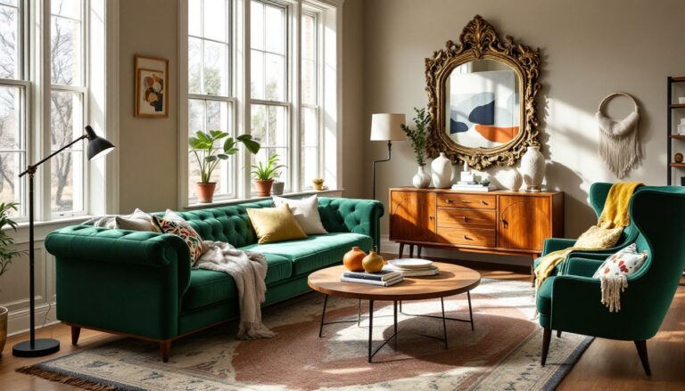
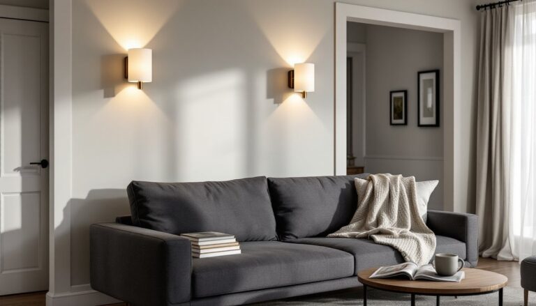
Furniture is where this color scheme gets practical. A grey sofa in a durable fabric like polyester-blend or microfiber holds up well in high-traffic homes and provides a neutral anchor. Pair it with a brown leather chair or ottoman for contrast and texture, leather ages well and develops character over time, unlike synthetic alternatives that just look worn.
Wood furniture in walnut, oak, or acacia naturally introduces brown tones without requiring additional upholstery. A coffee table or media console in medium-brown wood balances a grey sectional and adds visual weight to the lower third of the room. For smaller spaces, consider furniture with exposed legs rather than skirted pieces: the visible floor area makes the room feel larger.
Layout-wise, anchor the seating around a focal point, fireplace, TV, or large window. In rectangular rooms, float the sofa a few feet from the wall rather than shoving it against the perimeter. This creates a more intentional, finished look and improves traffic flow.
If working with hand-me-downs or mismatched pieces, slipcovers in grey linen or canvas can unify disparate furniture styles. Brown accent pillows, throws, or a patterned rug tie the palette together without requiring new furniture. This approach keeps costs down while maintaining a cohesive look, and many living room sets follow similar principles for built-in harmony.
Accent Colors and Decor to Complement Grey and Brown
Grey and brown form a neutral foundation, which means accent colors have room to shine without clashing. The trick is choosing accents that enhance rather than compete.
Warm metallics, brass, copper, or bronze, add richness and reflect light without the starkness of chrome or nickel. Consider hardware on furniture, picture frames, or lamp bases in these finishes.
Muted greens (sage, olive, or eucalyptus) bring an organic, calming quality and echo the natural undertones in brown wood. A few potted plants or botanical prints work well here.
Burnt orange or terracotta injects energy and warmth, especially in cooler grey palettes. Use these sparingly, throw pillows, a ceramic vase, or a single accent chair.
Navy or charcoal blue deepens the palette and adds sophistication without introducing jarring contrast. This works particularly well in luxury living rooms where layered, refined tones create a polished effect.
Avoid overloading the space with too many accent colors. Stick to two or three, and let them appear in multiple places, pillows, art, a rug, to create visual rhythm. Decor from sources like Homedit often showcases how restrained accent choices maintain cohesion in neutral schemes.
Textures and Materials That Elevate the Look
Texture is what prevents a grey and brown room from reading as flat or boring. Without it, even a well-chosen palette feels one-dimensional.
Leather (on chairs, ottomans, or trim details) ages beautifully and introduces a tactile richness. Full-grain leather is the most durable: top-grain is more affordable but still quality.
Linen and cotton in grey tones offer softness and light reflection. Linen curtains, in particular, diffuse natural light while adding subtle texture. They wrinkle easily, which some people love for the relaxed look and others hate, know your preference before committing.
Wool or jute rugs ground the space and add warmth underfoot. A jute rug in natural tan or brown pairs well with grey flooring or furniture, though it’s rougher than wool and not ideal for homes with crawling kids. Wool is softer, more durable, and easier to clean but costs more, expect $8–$15 per square foot for quality wool versus $3–$7 for jute.
Wood paneling or shiplap (in natural or stained finishes) adds architectural interest to wall colors and breaks up large expanses of flat paint. If installing, use 1×6 or 1×8 pine or MDF boards: real dimensions are 3/4″ thick, so plan spacing accordingly. Attach to studs with a brad nailer and finish with caulk and paint or stain. This is a weekend project for most DIYers and doesn’t require a permit unless modifying load-bearing walls.
Metal and glass (in tables, shelving, or light fixtures) prevent the room from feeling too soft or rustic. Mixing in harder, reflective surfaces balances the organic warmth of wood and fabric. Resources like Decoist frequently feature examples of textured layering in neutral palettes.
Lighting Strategies to Enhance Your Color Scheme
Lighting can make or break a grey and brown room. Poor lighting turns grey muddy and brown drab: good lighting brings out depth and warmth in both.
Layered lighting is essential. Combine ambient (overhead), task (reading lamps, sconces), and accent (picture lights, LED strips) sources. Relying on a single ceiling fixture flattens the space and kills any sense of dimension.
Bulb color temperature matters. Use 2700K–3000K (warm white) bulbs to enhance brown tones and prevent grey from feeling cold. Avoid bulbs above 3500K in living areas: they skew blue and make the room feel clinical. LED bulbs in this range are widely available and energy-efficient, look for a CRI (color rendering index) of 90 or higher for accurate color representation.
Dimmer switches add flexibility and are a straightforward DIY install if the existing switch box has a neutral wire (required by NEC for most new construction). If unsure, hire an electrician, improper wiring is a fire hazard and voids insurance.
Natural light should be maximized but controlled. Sheer or linen curtains diffuse harsh midday sun while preserving brightness. For west-facing windows that blast afternoon light, consider cellular shades or solar shades with a 5–10% openness factor, they reduce glare without completely blocking the view.
Accent lighting on textured walls or artwork creates visual interest after dark. Battery-operated LED puck lights or plug-in picture lights are low-commitment options that don’t require running new wiring. Discussions on MyDomaine often highlight how strategic lighting transforms neutral interiors.
Conclusion
Grey and brown don’t need gimmicks to work, they need intention. By balancing tones, layering textures, and lighting thoughtfully, this pairing creates a living room that’s both timeless and livable. It’s forgiving enough for DIY experimentation but sophisticated enough to grow with changing tastes. Start with the bones, paint and furniture, then build in personality through accents and materials. The result is a space that feels collected, not decorated.