Small kitchens don’t have to feel cramped or dull. The right color palette can make a tight galley or compact U-shaped kitchen feel significantly more open, airy, and inviting. But choosing the right color isn’t just about picking what’s trendy, it’s about understanding how light reflects off surfaces, how contrasting tones create depth, and how strategic color placement can draw the eye upward or outward. Whether working with tired oak cabinets, limited natural light, or awkward sightlines, the homeowner has more control than they might think. This guide walks through proven color strategies that balance style with spatial psychology, helping anyone maximize every square foot.
Table of Contents
ToggleKey Takeaways
- Kitchen color ideas for small kitchens should leverage light reflectance to make tight spaces feel open—white and greige tones maximize perceived size without appearing clinical.
- Two-tone color combinations, such as light uppers with darker lowers or a contrasting island, create visual depth and prevent small kitchens from feeling flat or floating.
- Dark colors like navy and charcoal can work in small kitchens when paired with ample lighting and reflective materials like white quartz countertops to prevent a cave-like effect.
- Test paint and tile samples on all walls at different times of day to ensure your chosen palette performs correctly under your kitchen’s specific natural and artificial lighting conditions.
- Coordinate cabinet, wall, and backsplash colors by maintaining at least a 10-point difference in Light Reflectance Value (LRV) between cabinets and walls to define the space without harsh lines.
- Use accent colors strategically in no more than two areas—such as backsplash tile, hardware, or open shelving—repeating each accent in at least three places to create intentional, cohesive design.
Why Color Choice Matters in Small Kitchen Design
Color affects how the brain perceives space. Light hues reflect more lumens, making walls recede visually. Dark tones absorb light, which can either shrink a room or add dramatic depth when applied correctly. In a 100-square-foot kitchen, the difference between a flat white ceiling and a warm gray can change the perceived height by several inches.
Beyond optical tricks, color impacts mood and function. A kitchen bathed in cool blues may feel crisp but sterile, while warm terracotta tones add coziness that can make a small space feel snug rather than suffocating. The homeowner should also consider resale value, neutral palettes typically appeal to a broader audience, but a well-executed bold choice can become a memorable selling point.
Finally, color interacts with light sources. A north-facing kitchen with limited sun will render cool grays as dingy, while the same shade in a south-facing space feels fresh. Test paint samples on all walls and observe them at different times of day before committing. This prep step prevents costly repaints and ensures the chosen palette performs as intended.
Light and Bright: White and Neutral Color Schemes
Pure white (like Benjamin Moore’s Chantilly Lace or Sherwin-Williams’ Extra White) remains the go-to for maximizing reflected light. It pairs well with stainless steel appliances and creates a clean backdrop for open shelving. But, stark white can feel clinical in kitchens lacking natural light, warm whites with subtle cream or ivory undertones (e.g., Benjamin Moore’s White Dove) offer a softer alternative.
Greige (gray-beige hybrids) has dominated kitchen design since 2020 and shows no signs of fading. Shades like Agreeable Gray or Revere Pewter provide neutrality without the coldness of true gray. They hide minor imperfections better than pure white and complement both modern and traditional cabinetry. For walls, use a lighter greige (LRV of 60+) and consider a slightly deeper tone on lower cabinets to ground the space.
Off-white cabinets with white subway tile backsplash and pale gray grout creates a monochromatic scheme that expands visual boundaries without reading as boring. Add warmth with natural wood accents (butcher block counters, floating shelves) and matte black hardware for contrast. This approach works especially well in rentals or flips where broad appeal is critical.
One caution: all-white kitchens require diligent cleaning. Grease splatters, fingerprints, and scuffs show immediately. If the household includes kids or heavy cooking, consider white uppers with a more forgiving mid-tone on lowers.
Bold and Beautiful: Using Dark Colors to Create Depth
Dark colors in small kitchens sound counterintuitive, but designers increasingly use deep navy, charcoal, or forest green to create cocooning, jewel-box spaces. The trick is balancing dark surfaces with ample lighting and reflective materials. A small kitchen with excellent lighting (recessed LEDs, under-cabinet strips, and pendant fixtures) can handle deep tones that a poorly lit space cannot.
Navy blue cabinets (like Hale Navy or Naval) paired with white quartz countertops and brass hardware creates high contrast that defines edges and makes the room feel intentional rather than cramped. The white counters reflect light downward, preventing the space from feeling like a cave. This combination works especially well in galley kitchens where the eye moves linearly, the dark cabinets recede while the bright counters lead the gaze forward.
Charcoal gray walls with light-colored cabinets flip the script. Painting walls a dark hue (LRV below 20) can make them “disappear,” especially when cabinets are white or pale wood. The contrast pulls focus to the cabinetry and countertops, making the room’s perimeter feel less defined. This technique works best in kitchens with at least one large window or glass door.
Avoid painting both walls and cabinets dark unless the kitchen has exceptional natural light and high ceilings (8 feet minimum). Even then, incorporate plenty of white or metallic accents. And always use semi-gloss or satin finishes on dark cabinets, the sheen bounces light and prevents the color from feeling flat.
Consider testing deep accent tones in small doses first, such as a single accent wall or just the island, before committing to full-room saturation.
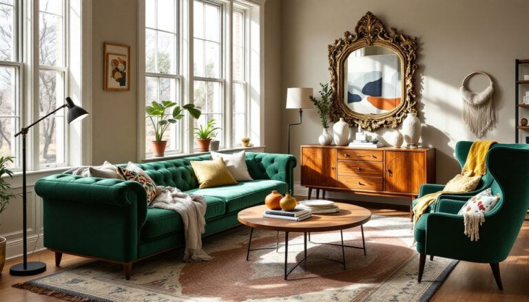
Two-Tone Kitchen Color Combinations That Expand Visual Space
Two-tone kitchens break up visual monotony and create focal points that guide the eye strategically. The most common approach: light upper cabinets with darker lowers. White or cream uppers keep the upper half of the room bright and open, while navy, sage green, or gray lowers add weight and grounding. This prevents the “floating” feeling that all-light kitchens can have and makes standard 8-foot ceilings feel taller by drawing the eye upward.
Contrasting island color is another popular move. If perimeter cabinets are white, paint the island a bold hue like hunter green, deep teal, or even black. The island becomes a statement piece, and the color contrast creates visual interest without overwhelming the space. Ensure the island color pulls from other elements in the home to maintain cohesion, if the living room has navy accents, echo that in the kitchen island.
Vertical color blocking can trick the eye into perceiving more height. Paint upper cabinets and the ceiling the same light color, then use a mid-tone on lowers and a darker shade on the floor. The continuous light plane overhead makes the ceiling feel higher, while the graduated tones below provide visual weight.
When mixing finishes, keep sheen consistent across cabinets (all matte or all satin) but vary it on walls and trim. Semi-gloss trim in the same color family as matte walls adds subtle dimension without competing with cabinetry. And always select colors with similar undertones, pairing a cool gray with a warm beige creates visual discord that can make a small space feel even more disjointed.
Accent Colors and Strategic Pops of Personality
Accent colors inject personality without committing large surfaces to bold hues. In small kitchens, less is more, one or two accent colors maximum. A cheerful palette might include soft yellow bar stools or dish towels against a neutral backdrop, while a modern scheme could feature matte black fixtures and a single shelf of colorful glassware.
Backsplash tile offers a high-impact accent opportunity. A geometric pattern in blues and whites, or a blush pink subway tile, adds color at eye level without overwhelming. Keep the tile area contained, typically 18 to 24 inches of vertical space between counters and uppers, so it reads as an accent rather than dominating the room.
Open shelving with colored dishware or cookbooks introduces flexible color that can change seasonally. Swap out bright coral bowls for deep plum in fall, or rotate between trending paint shades to test colors before committing to larger surfaces. This approach works well for renters who can’t repaint.
Hardware and fixtures provide another layer. Matte gold pulls, brushed copper faucets, or even colorful ceramic knobs (like cobalt or terracotta) add warmth and detail. In a neutral kitchen, hardware becomes jewelry, small but impactful.
One rule: accent colors should appear in at least three places to feel intentional. If the backsplash is teal, echo that in a vase, a small appliance, and perhaps the underside of floating shelves. This repetition creates rhythm rather than randomness, a design principle that makes even eclectic choices feel cohesive.
Cabinet, Wall, and Backsplash Color Coordination Tips
Coordination doesn’t mean everything matches, it means every color choice supports the overall goal. Start with the largest surface: cabinets. If existing cabinets are staying, let them dictate the palette. Honey oak cabinets pair best with warm whites and soft greens, not cool grays that will clash with the yellow undertones. If painting cabinets, choose a color first and build around it.
Wall color should be lighter than cabinets if the goal is openness. A good rule of thumb: walls should have an LRV (Light Reflectance Value) at least 10 points higher than cabinets. If cabinets are LRV 40 (medium gray), walls should be LRV 50+ (light gray or white). This ensures enough contrast to define the space without creating harsh lines.
Backsplash can either blend or contrast. Blending (same color family, slightly different tone) creates a seamless look that elongates the wall plane, useful in narrow kitchens. Contrasting (white cabinets, dark blue backsplash) creates a focal point and adds depth. For small kitchens, subway tile in a 3×6-inch format works better than large-format tile, which can overwhelm the scale.
Countertops tie everything together. White quartz works with nearly any cabinet and wall color, while butcher block adds warmth to cool palettes. Avoid busy granite or marble patterns in small kitchens, they fragment the visual field. Solid or subtly veined surfaces keep sightlines clean.
Test colors together before purchasing. Bring cabinet samples to the tile showroom, or order peel-and-stick samples from online design resources to see how everything interacts under your specific lighting. This step prevents mismatched undertones, cool gray tile next to warm beige cabinets creates an unintentional clash that’s hard to live with.
Conclusion
The right color palette transforms a small kitchen from a cramped afterthought into a functional, welcoming space. Whether leaning into light neutrals that maximize reflection, embracing bold darks for drama, or layering two-tone combinations for depth, each approach requires thoughtful planning and testing. Coordinate cabinets, walls, and backsplash with attention to light reflectance and undertones, and use accents sparingly to add personality. Most importantly, observe how colors perform in the specific space throughout the day before committing to gallons of paint or permanent tile. Small doesn’t mean limited, it means every choice carries more weight.