When it comes to wall colors for living rooms, the stakes are high. It’s not just paint: it’s the ambiance, the mood, and, let’s face it, the subject of countless Instagram posts. Your living room should reflect your personality like a comfortable pair of shoes, stylish yet practical. Whether you want to brighten things up or create a cozy, intimate nook, the right color can do wonders. Buckle up as we embark on a colorful journey to decode the secrets behind choosing the perfect wall colors for your living room.
Understanding the Psychology of Color
Colors aren’t just pretty: they hold emotions and meanings. Understanding the psychology behind colors can be a game-changer when choosing wall colors for living rooms. For instance, blue is often associated with calmness and serenity. Imagine lounging in a blue-hued room, sipping tea, and feeling the stress of the day just melt away. On the other hand, red can symbolize passion and energy, which makes it a bold choice for social spaces where you want to ignite conversations.
Also, let’s not overlook yellow. Bright and cheerful, it can radiate positivity and make your living room feel like a sun-kissed dream. But, moderation is key: too much yellow might just turn your sanctuary into a scene from a cartoon. Understanding these emotional responses helps in selecting a wall color that aligns with your desired atmosphere. It’s crucial to think about how you want to feel when you enter your living room. That sunny yellow might just brighten your mood or annoy your senses, choose wisely.
Popular Color Schemes for Living Rooms
Now that the psychology is out of the way, let’s talk about some popular color schemes that are stealing the show in living rooms today. Neutrals reign supreme for those wanting a timeless vibe. Shades of beige, gray, and soft white are versatile and can easily blend with various furniture styles. They create a clean canvas for accent pieces to shine.
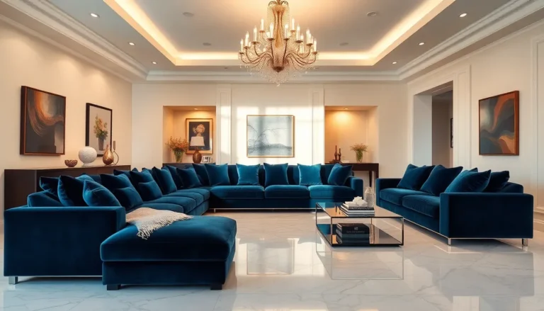
If you’re feeling adventurous, consider jewel tones. Rich hues like emerald green, sapphire blue, and deep aubergine can add a touch of sophistication and drama. These colors can make a strong statement while providing warmth. Pair them with soft textiles and shiny accents, and voilà. You have a luxurious living space.
For those who love nature, earthy tones like terracotta, sage green, and muted browns bring a sense of grounding. They connect your living space with the outdoors, perfect for creating a tranquil atmosphere. Mixing different shades within a chosen palette is a fantastic way to add depth without risking a color clash.
Factors to Consider When Choosing Wall Colors
Choosing wall colors for living rooms involves evaluating a few essential factors to ensure a harmonious look. First, consider the room’s size and lighting. Lighter colors tend to make small spaces feel larger, while darker shades provide coziness but may shrink the space visually. So, if your living room is more tiny than spacious, lean toward those soft, airy hues.
Next up is the existing furniture and decor. The wall color should play nice with your sofas, rugs, and artwork. If you have bold furniture, calmer wall colors can balance the overall aesthetic. Conversely, if you prefer minimalism, bold wall colors can act as the statement piece.
Don’t forget about the orientation of your room in relation to natural light. East-facing rooms bask in morning light, while west-facing ones see afternoon sun. This affects how wall colors appear. Always test colors in different lighting throughout the day to see how they change. Choosing wisely means considering all these elements to ensure your space reflects your style.
Finishes and Techniques to Complement Your Walls
Now that the base color is decided, what about finishes and techniques? A high-gloss finish may look fabulous in a contemporary setting, catching light beautifully and lending a sense of sophistication. Semi-gloss finishes are often used for accent walls, perfect for showcasing unique architecture. They’re also easy to clean, ideal for homes with kids or pets.
Matte finishes, while more muted, offer a chic, modern appeal. They absorb light rather than reflecting it, creating a soft, inviting atmosphere. But, keep in mind that matte finishes might not be as durable as their glossy counterparts when it comes to cleaning.
Techniques like color washing or sponging can also add character to living room walls. They blend multiple colors and create texture, offering a unique vibe. Whoever said walls were just for painting clearly didn’t think outside the box, or the brush.
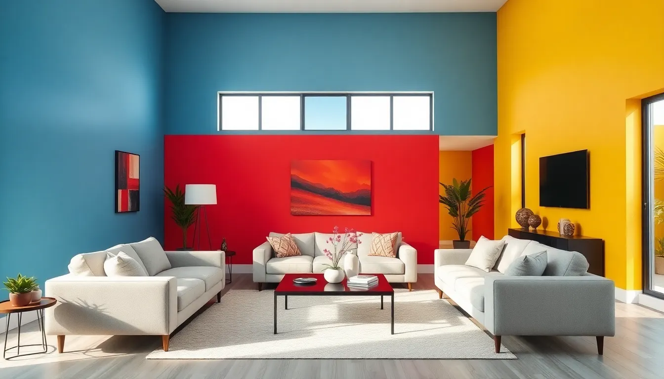
Accent Walls: Adding Depth and Interest
Accent walls have become a go-to option for many when looking to spice things up. Imagine walking into a living room and being greeted by one wall painted in a vibrant hue, drawing your eyes like a moth to a flame. Accent walls can highlight architectural features or simply serve as a bold statement.
Choosing the right wall for an accent can be a game changer. Typically, it’s best to select the wall that naturally catches the eye first, often behind the main furniture piece, like the sofa. Consider also using wallpapers with intricate designs for added texture, this can be a great way to bring a splash of personality.
The goal is to create balance. If the other walls are neutral, feel free to go wild on the accent wall. But, if everything else is vibrant, it’s essential to ensure the accent color complements rather than clashes with the overall scheme.
Maintaining Your Living Room Walls
Once the walls are painted and all set, the next step is ensuring they remain as stunning as the day they were finished. Regular maintenance is vital. Dust and dirt can diminish the beauty of colors, so simple cleaning with a soft cloth can make a big difference.
Most paints can withstand routine cleaning, but it’s always wise to know the finish you chose, some might require special care. In high-traffic areas, consider using a wipeable finish to make cleanup a breeze.
Don’t forget the power of touch-ups. Keeping a small sample of the original paint on hand ensures that minor scuffs or scratches can be addressed without any color mismatch. This attention to detail not only maintains the aesthetic but keeps the overall look fresh and inviting.