Choosing paint isn’t about following trends, it’s about creating a space that works morning, noon, and night. Warm neutral paint colors deliver what most living rooms need: a backdrop that feels inviting without competing with furniture, art, or the view out the window. Unlike cool grays that can read sterile under certain lighting, warm neutrals carry undertones of yellow, red, or brown that add depth and make a room feel lived-in from day one. They’re forgiving with mismatched furniture, they photograph well, and they age gracefully as your style evolves. This guide covers the mechanics of selecting and applying warm neutrals, from understanding undertones to coordinating with existing finishes.
Table of Contents
ToggleKey Takeaways
- Warm neutral paint colors create an inviting backdrop for living rooms by adding depth through yellow, red, or brown undertones while allowing furniture and art to take center stage.
- Natural light direction significantly impacts how warm neutrals perform—north-facing rooms benefit from yellow or red undertones to compensate for cool indirect light, while south-facing rooms can handle lighter tones.
- Always test warm neutral paint colors with large 2’×2′ samples directly on walls in morning, afternoon, and evening light for at least 48 hours to ensure undertones don’t shift unexpectedly throughout the day.
- Warm neutrals pair exceptionally well with natural materials like linen, leather, and untreated wood, plus warm metal finishes such as brass and copper, creating a cohesive and harmonious interior.
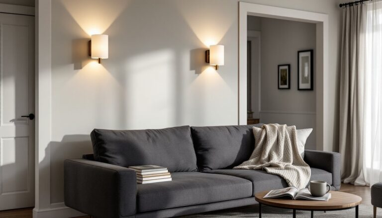
- Warm whites and creams should be matched with lighting temperature—use LED bulbs rated 2700K–3000K to enhance yellow undertones and avoid dingy-looking walls under cooler 4000K+ bulbs.
Why Warm Neutrals Are Perfect for Living Rooms
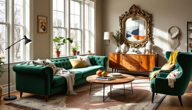
Warm neutrals handle the hardest job in interior painting: they unify a space without dictating its character. Living rooms see variable natural light throughout the day, and warm undertones, whether yellow, terracotta, or taupe, adapt better than stark whites or cool grays that can shift blue or green depending on the hour.
From a practical standpoint, warm neutrals hide imperfections. Slight texture variations in drywall, minor dings, or patched nail holes are less visible in a mid-tone beige than in a bright white or deep charcoal. They also provide better contrast for trim work: white trim pops cleanly against a warm taupe wall without the harshness of a dark accent color.
Warm neutrals also increase perceived room temperature, a real consideration in north-facing rooms or spaces with limited sunlight. A creamy off-white with yellow undertones can make a dim room feel 5–10 degrees warmer visually, reducing the cave-like quality that cooler tones can create.
Another advantage: resale flexibility. While bold accent walls can alienate buyers, warm neutrals test well across demographics and style preferences. They read as a finished backdrop rather than a style statement, which helps potential buyers envision their own furniture and decor in the space. That’s not design cowardice, it’s strategic neutrality.
Finally, warm neutrals play well with mixed materials. If the living room features exposed brick, wood beams, leather furniture, or metal fixtures, a warm neutral wall color ties those elements together without clashing. Cool grays can make warm wood tones look orange by contrast: warm neutrals harmonize instead of fighting.
Top Warm Neutral Paint Colors to Consider
Beige and Greige Tones
Beige isn’t a single color, it’s a spectrum. True beiges lean into tan and brown, carrying red or yellow undertones that add warmth without reading as distinctly “colored.” Greige (gray + beige) splits the difference, offering the sophistication of gray with the warmth of beige. It works especially well in homes with both warm wood and cool metal finishes.
When evaluating beige or greige, paint a 2’×2′ test square on at least two walls, one that gets morning light and one that gets afternoon light. Undertones shift dramatically depending on exposure. A greige that looks perfect at 10 a.m. might read lavender at 6 p.m. if it has too much gray.
For color schemes for living rooms that lean traditional, deeper beiges with brown undertones create a grounded, library-like feel. For modern or transitional spaces, lighter greiges with hints of gray provide a cleaner backdrop. Both work with brass, bronze, or black hardware, just ensure the undertone matches the metal finish. Cool-toned greiges pair best with chrome or stainless: warm beiges complement oil-rubbed bronze or aged brass.
Avoid beiges that read orange or pink unless that’s an intentional choice. These tones can clash with cool-toned furniture or make skin tones look off in photos. When in doubt, compare your sample to a true neutral gray and a warm brown: a good beige or greige should fall comfortably between the two without leaning hard in either direction.
Warm Whites and Creams
Warm whites aren’t pure white, they carry enough yellow, cream, or beige to prevent the sterile, blue-shifted look of cool whites. In living rooms, warm whites brighten without the glare. They’re ideal for trim, ceilings, and walls in spaces with abundant natural light.
Creams sit between warm white and beige. They have enough pigment to register as a color rather than an absence of color, but they’re light enough to keep small rooms feeling open. Cream works well in living rooms with dark wood floors or heavy furniture, providing contrast without adding visual weight.
When selecting warm whites or creams, test them against your existing trim. If trim is a cool bright white, a cream wall can make the trim look dingy by comparison. In that case, either repaint the trim or choose a lighter warm white that’s closer in value. If trim is an off-white or a warmer tone, creams integrate seamlessly.
Lighting temperature matters here more than anywhere else. LED bulbs rated at 2700K–3000K (warm white) enhance the yellow undertones in these paints. Bulbs above 4000K (cool white or daylight) will fight the warmth and make the walls look dingy. Match your bulb temperature to your paint undertone.
One often-overlooked factor: sheen. Warm whites and creams in eggshell or satin reflect light softly and hide minor imperfections. Flat finishes absorb light and can look chalky in high-traffic living rooms: semi-gloss is too reflective for walls unless you’re going for a vintage or coastal look. Eggshell hits the sweet spot for most living rooms, washable but not shiny.
How to Choose the Right Warm Neutral for Your Living Room
Start by evaluating natural light direction and quantity. South-facing rooms get warm, consistent light all day and can handle cooler-leaning greiges or lighter warm whites without feeling cold. North-facing rooms receive indirect, cooler light: in these spaces, beiges with yellow or red undertones compensate for the lack of warmth. East-facing rooms get strong morning light that can make warm colors look more saturated: west-facing rooms get intense afternoon sun that can wash out lighter tones.
Next, consider the room’s existing fixed finishes. If the living room has oak or pine floors with warm orange or yellow tones, choose a neutral with complementary warm undertones, beiges with yellow or tan bases. If floors are walnut, cherry, or another reddish wood, greiges with subtle red undertones harmonize better than cool grays. For gray or whitewashed floors, lighter greiges or warm whites provide enough contrast without clashing.
Test paint in the actual space. Buy sample quarts of 3–4 colors and paint large squares directly on the wall (not poster board, which doesn’t show true color against the surface texture). Live with the samples for at least 48 hours, checking them in morning, midday, and evening light. Undertones that seem invisible in the store can dominate once applied.
Pay attention to adjacent rooms. If the living room opens into a kitchen or hallway with existing paint, choose a warm neutral that transitions smoothly. A greige living room next to a cool gray kitchen can create a jarring shift. When popular paint colors for living rooms vary widely across home trends, continuity between spaces creates cohesion.
Finally, factor in the room’s purpose and traffic. Living rooms used primarily in the evening benefit from slightly darker, cozier warm neutrals, mid-tone beiges or deeper greiges that feel intimate under lamplight. Living rooms that double as home offices or playspaces need lighter tones to maintain energy and alertness during the day. If the room hosts frequent gatherings, test how the color photographs under typical lighting: overly warm tones can skew orange in photos, while overly cool neutrals can look washed out.
Pairing Warm Neutral Walls with Furniture and Decor
Warm neutral walls function as a stage, not the star. The goal is to let furniture, art, and textiles take focus while the walls provide visual breathing room. That said, pairing requires deliberate choices to avoid a washed-out or monotone result.
Start with contrast in value and texture. If walls are a light cream, bring in furniture with darker tones, espresso wood, charcoal upholstery, or black metal frames. If walls are a medium beige or greige, mix light and dark furniture to create layers. A common mistake is matching everything to the wall color, which flattens the space. Successful wall colors for living rooms allow furniture to pop rather than blend.
Warm neutrals pair exceptionally well with natural materials: linen, jute, leather, untreated wood, stone, and clay. These textures share the same warm undertones and create a cohesive, organic look. A greige wall, a jute rug, linen curtains, and a leather sofa work together without needing additional color. If that feels too monochromatic, add one accent color, rust, olive, navy, or terracotta, through pillows, throws, or a single piece of art.
Metal finishes matter. Warm neutrals harmonize with brass, copper, gold, and oil-rubbed bronze. These metals share warm undertones and feel intentional rather than mismatched. Chrome, nickel, and stainless steel can work but require careful balancing: too much cool metal against a warm wall can feel disjointed. If existing fixtures are cool-toned, consider mixing in a few warm metal accents (lamp bases, picture frames, cabinet pulls) to bridge the gap.
For art and decor, warm neutral walls act as a gallery backdrop. Bold, colorful art stands out against a greige or beige wall without competing. Black-and-white photography reads crisp and modern. If the walls are very light, even subtle wall art for living rooms in muted tones will have enough contrast to register. If walls are mid-tone, art needs higher contrast or saturation to avoid disappearing.
Window treatments should either blend or contrast, no in-between. Linen or cotton curtains in a shade slightly lighter or darker than the wall color create a seamless, elevated look. If contrast is preferred, go bold: charcoal, navy, or even a subtle pattern. Avoid matching curtains exactly to wall color: it reads flat and unfinished. Layering with a valance or trim in a different texture can add dimension.
Finally, consider the ceiling and trim. White or off-white trim creates clean lines and makes warm neutral walls feel polished. Painting trim the same color as the walls (a technique gaining traction in modern interiors) can make small rooms feel larger by eliminating visual breaks, but it requires precise execution, any drips or uneven edges will show. A satin finish on trim provides durability and a subtle contrast against eggshell walls even when using the same color.
Conclusion
Warm neutral paint colors aren’t about playing it safe, they’re about building a flexible, functional foundation. When chosen with attention to light, undertones, and existing finishes, they create living rooms that feel complete without being overly styled. Test thoroughly, prime properly, and don’t skip the second coat. The result is a space that adapts as furniture, decor, and needs change over time.