Gold isn’t just for jewelry boxes and picture frames anymore. When used thoughtfully, gold living room decor adds a layer of sophistication and warmth that few other finishes can match. It catches light, creates focal points, and pairs with nearly every color palette, from crisp whites to deep navy blues. Whether you’re working with a tight budget or planning a full room refresh, gold accents can elevate your space without requiring structural changes or professional installation. The key is knowing which shade to choose, where to place it, and how much is enough before it tips into gaudy territory.
Table of Contents
ToggleKey Takeaways
- Gold living room decor adds sophistication and warmth by catching light to create focal points that work across traditional, contemporary, and modern design styles.
- Choose the right shade of gold by testing warm golds with wood tones, cool golds with grays and whites, and matte finishes for versatility—observation in natural and artificial light is essential.
- Gold accent furniture like side tables, coffee table bases, and mirrors serve as functional focal points that instantly elevate a space without requiring structural changes.
- Lighting fixtures in gold finishes are one of the most effective ways to introduce gold; pair them with warm white bulbs (2700K) and fabric shades to enhance warmth and prevent glare.
- Textiles including throw pillows, curtains, and area rugs offer the fastest and most affordable way to test gold accents while maintaining design flexibility for seasonal updates.
- Balance gold with complementary color palettes such as navy and gold for regal spaces, emerald and gold for glamour, or white and gold for timeless elegance.
Why Gold Decor Works in Modern Living Rooms
Gold brings a unique combination of warmth and reflectivity that works across design styles, traditional, contemporary, mid-century modern, and even industrial. Unlike silver or chrome, which read cool and sterile, gold tones lean warm and inviting.
The metal’s reflective quality bounces natural and artificial light around the room, making spaces feel larger and brighter without adding windows or fixtures. This is especially useful in north-facing rooms or basements where natural light is limited.
Gold also functions as a neutral in many contexts. When used in matte or brushed finishes, it doesn’t compete with bolder colors, it anchors them. Pair it with jewel tones like emerald or sapphire for drama, or with blush and cream for a softer, layered look. The finish’s versatility means it doesn’t lock you into one aesthetic. You can swap out textiles, rugs, or wall art without the gold feeling dated.
From a practical standpoint, gold finishes, especially powder-coated or lacquered metals, are durable and low-maintenance. They resist tarnish better than brass and don’t show fingerprints as readily as polished chrome.
Choosing the Right Shade of Gold for Your Space
Not all golds are created equal. The undertones, finish, and intensity make a huge difference in how the color reads in your room.
Warm golds (often called champagne or antique gold) have yellow or orange undertones. These work well in rooms with warm lighting (2700K–3000K bulbs) and pair naturally with wood tones, terracotta, and rust. They feel cozy and lived-in, ideal for traditional or eclectic spaces.
Cool golds (sometimes labeled rose gold or pale gold) lean pink or silver. These suit modern or Scandinavian interiors and pair well with grays, whites, and cooler wall colors. They’re less intense and blend more subtly into minimalist settings.
Bright or polished golds are high-shine and demand attention. Use these sparingly, think picture frames, lamp bases, or hardware, unless you’re going for a maximalist look. Too much polished gold can feel overwhelming or dated if not balanced with matte textures.
Matte or brushed golds offer sophistication without glare. These finishes work in nearly any setting and don’t require as much restraint. They’re forgiving with existing finishes and won’t clash with mixed metals.
Test samples in your actual space before committing. Paint a foam board with gold metallic paint or bring home fabric swatches. Observe them in morning, afternoon, and evening light, gold’s appearance shifts dramatically depending on the source and angle of light.
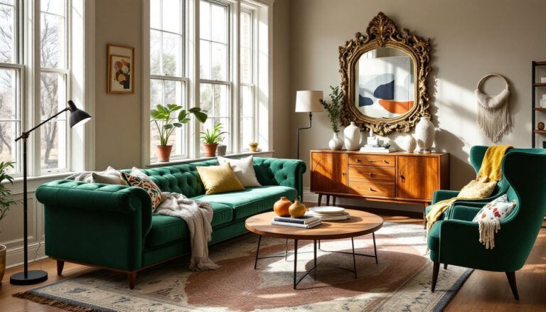
Gold Accent Furniture and Statement Pieces
Furniture with gold accents or frames serves as both function and focal point. Start with pieces that don’t require heavy commitment: side tables, coffee table bases, bar carts, or accent chairs with gold legs.
Metal-framed furniture (think hairpin legs or geometric bases) is widely available and affordable. Look for powder-coated finishes rather than painted gold, which can chip or wear unevenly. Powder coating creates a durable, smooth finish that holds up to daily use.
If you’re handy with a spray gun, you can DIY gold accents on existing furniture. Use a metal primer first, then apply two thin coats of metallic spray paint in a well-ventilated area. Seal with a clear polyurethane topcoat for durability. A small HVLP sprayer (around $100) gives more even coverage than aerosol cans and is worth the investment if you’re tackling multiple pieces.
Statement pieces like gold-framed mirrors, console tables, or etageres anchor a room and provide a design through-line. According to design galleries like those featured by Architectural Digest, gold accent pieces instantly elevate a space when paired with rich textures and layered finishes. A large gold-framed mirror over a sofa or mantel doubles as art and amplifies light.
Avoid matching every gold piece exactly. Mixing warm and cool golds, or combining brushed and polished finishes, adds depth and prevents the room from feeling like a showroom. Real luxury living spaces layer metals intentionally rather than coordinating them to perfection.
Incorporating Gold Through Lighting Fixtures
Lighting is one of the most effective ways to introduce gold without overwhelming a space. Fixtures double as functional necessities and sculptural elements.
Ceiling fixtures like chandeliers, pendant lights, or flush-mounts in gold finishes become instant focal points. For standard 8-foot ceilings, choose fixtures no larger than 20–24 inches in diameter to maintain proportion. In rooms with higher ceilings or open floor plans, you can go bigger, 30 inches or more.
When selecting a chandelier or pendant, consider the bulb type and color temperature. Warm white bulbs (2700K) enhance gold’s warmth, while daylight bulbs (5000K+) can make gold look brassy or cheap. Use dimmable LED bulbs to adjust mood and intensity.
Table and floor lamps with gold bases or arms are easy swaps that don’t require electrical work. Look for lamps with fabric shades rather than metal or glass, fabric softens the light and prevents harsh glare off the gold finish. Tripod floor lamps with gold legs work well in modern spaces, while traditional urn-shaped bases suit classic interiors.
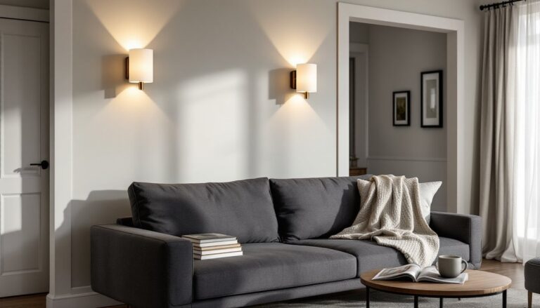
Sconces add layered lighting and visual interest on blank walls. Gold wall sconces flanking a mirror, fireplace, or living room set create symmetry and balance. Install them 60–66 inches from the floor to the center of the fixture for optimal light distribution. If you’re not comfortable running new electrical, plug-in sconces with cord covers are a DIY-friendly alternative.
Always use a voltage tester and turn off power at the breaker before installing hardwired fixtures. If your home has older wiring or you’re unsure about load capacity, consult a licensed electrician.
Textiles and Soft Furnishings in Gold Tones
Textiles are the fastest, most affordable way to test gold in your living room. They’re also the easiest to swap out seasonally or when you’re ready for a change.
Throw pillows in gold velvet, linen, or jacquard add texture and sheen. Velvet catches light beautifully and feels luxe, while linen offers a more casual, matte finish. Mix pillow sizes, 18-inch, 20-inch, and 22-inch squares, and layer patterns (geometric, solid, and subtle metallics) to avoid a matchy-matchy look.
Throws and blankets in gold or metallic thread bring warmth to sofas and chairs. Look for blends with cotton or wool for durability: pure metallic fabrics can feel stiff or scratch easily. Drape them casually over one arm of the sofa rather than folding them perfectly, this creates a lived-in, approachable vibe.
Curtains or drapes in sheer gold or gold-threaded fabric filter light and add shimmer without blocking natural brightness. For blackout needs, use gold as an accent panel or trim on neutral drapes. Standard curtain panels are 84, 96, or 108 inches long: measure from the rod to the floor and add 2–3 inches for a slight break or pooling effect. Mount rods 4–6 inches above the window frame to create the illusion of taller ceilings.
Area rugs with gold accents or borders ground the room and tie together disparate elements. Look for rugs with gold woven into patterns rather than printed on top, woven construction lasts longer and won’t fade as quickly. For living rooms, an 8×10-foot rug typically fits under the front legs of all seating pieces: a 9×12-foot rug accommodates larger layouts.
Balancing Gold with Complementary Color Palettes
Gold works hardest when it’s not working alone. The right color schemes let gold shine without stealing the show.
Navy and gold is a classic combo that feels both nautical and regal. Navy grounds gold’s brightness and prevents it from reading as gaudy. Use navy on large surfaces (sofas, accent walls) and gold in smaller doses (pillows, lamps, frames). This pairing works especially well in traditional and transitional spaces.
Emerald and gold channels old-world glamour. The jewel tone brings richness and depth, while gold adds sparkle. Balance is critical here, too much of both can feel heavy. Keep walls neutral (white, cream, or soft gray) and let the emerald and gold play out in furnishings and accessories.
Blush and gold offers a softer, more romantic take. This combo suits contemporary and feminine aesthetics. Use blush as the dominant color and gold as the accent. The warmth of gold complements blush’s pink undertones without competing.
Black and gold delivers high drama and contrast. This works in modern, Art Deco, or industrial interiors. Use matte black to temper gold’s shine, and keep proportions balanced, roughly 60% black, 30% neutral, and 10% gold.
White and gold is clean, bright, and timeless. It’s nearly foolproof and works across all styles. Layer textures (linen, wood, metal) to prevent the palette from feeling flat. This is also the easiest combo to update with pops of seasonal color.
When experimenting with popular paint colors, consider how gold accents will interact with your chosen hue. Test paint samples next to your gold elements before committing to a full room.
Conclusion
Gold living room decor doesn’t require a full renovation or a designer’s budget. Start small, a lamp, a mirror, a handful of pillows, and build from there. Pay attention to undertones, finishes, and proportions, and don’t be afraid to mix metals or shift your approach as your space evolves. Done right, gold brings a warmth and polish that feels intentional, not accidental.